Optimizing Your Headline for Maximum Impact
Crafting a Compelling Offer
When I first realized how crucial a killer headline was for my landing page, it was a game changer. Think about it: the headline is typically the first thing visitors see. It’s got to grab their attention right away! I started experimenting with different phrases, and guess what? Some straightforward tweaks made all the difference.
Instead of generic headlines, I began using specific benefits to my audience. For instance, rather than just saying “Improve Your Skills,” I switched to “Boost Your Productivity in Just 30 Minutes a Day.” This little change not only captured interest but also catered directly to what my audience wanted.
Play around with words that create urgency or intrigue. Adding elements like “limited time offer” can spur action because it creates that essential sense of need to act now. Always remember, the headline sets the stage, so make sure it’s captivating!
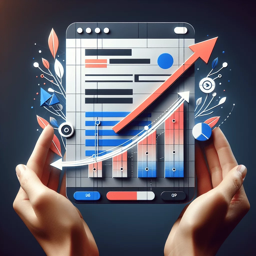
Utilizing Strong Visual Elements
Now, let’s talk visuals. Your landing page isn’t just about text; it’s a visual playground! Bringing in eye-catching images related to your offer grabs attention and enhances retention. I learned this the hard way—my initial plain backgrounds and boring stock images didn’t do me any favors.
Choose visuals that resonate with your audience. For instance, if I’m promoting a fitness program, I might use images of people achieving their goals or engaging in a workout. This relatable content gets people dreaming about how they can achieve those same results.
And remember color matters! Using contrasting colors for buttons can make them pop, guiding visitors to take action. Play around with these elements—visuals are basically your silent salespeople!
Testing and Tweaking for Success
Alright, let’s get into the nitty-gritty of testing. Once I made adjustments to my headline and visuals, I didn’t just sit back. I started A/B testing different versions of my landing page. This means running experiments with two or more variations to see which one performs better. It’s where the magic happens!
After a little time running the tests, I noticed clear patterns. For instance, one headline style produced more clicks than another. This process isn’t just vital; it’s fascinating to see what resonates with your audience! Don’t be afraid to experiment—it’s part of the journey.
And don’t just stop at the headline. Test visuals, calls-to-action, and even the layout. Continual tweaking leads to long-term improvement and ensures your landing page evolves with your audience’s tastes.
Enhancing Your Call-to-Action (CTA)
Creating a Clear and Compelling CTA
Diving right into CTAs—these are make-or-break moments for your landing page. I’ve gone through my fair share of mediocre CTAs that led to lackluster results. The key is to make them clear and action-oriented. Something like “Get Started” sounds nice, but “Claim Your Free Guide Now!” has way more punch!
Also, positioning matters! I found that placing my CTA button—say, below a well-crafted paragraph describing benefits—yielded better results. It’s all about context. You want to guide your visitors naturally toward that next step.
And listen, don’t underestimate the power of urgency. Phrases like “Limited offer” or “Only a few left” can create that sense of urgency needed to boost conversions. Make your audience feel like they have to act quickly!
Designing for Mobile Optimization
Let’s not forget about mobile users—this is an area I overlooked at first. Nowadays, many people browse primarily on their phones, so it’s essential that your landing page looks good on smaller screens. I can’t stress it enough: make sure your design is responsive!
I started using tools like Google’s Mobile-Friendly Test, and the results were eye-opening. Pages that were hard to navigate on mobile led to high bounce rates. I couldn’t allow that! So I revamped the design to ensure seamless browsing on any device.
Also, pay attention to load times. If it takes too long for the page to load, you’ll lose visitors faster than you can say “conversion.” Optimize images and minimize unnecessary elements to keep things running smoothly!
Leveraging Testimonials and Social Proof
Let’s chat about social proof. I’ve learned that showcasing testimonials can elevate credibility and trust on my landing page. When visitors see that others have benefited from a service or product, they’re more likely to convert. This was a game-changer for me!

I started carefully curating testimonials, highlighting different aspects of what my customers love. With real names and photos, it adds credibility. My favorite approach is using video testimonials—talk about authentic experience that truly resonates!
In addition, consider adding trust badges or quotes from well-known figures in your industry. This little nudge can turn a wary visitor into a loyal customer. People love to see validation before they make a decision; show them the benefits through others’ experiences!
Final Thoughts and Continuous Improvement
Reviewing Analytics for Insight
Now that I’ve made adjustments, it’s time to check statistics. The beauty of digital marketing is that it gives us data to analyze. I started using tools like Google Analytics, which has been invaluable for tracking visitor behavior and conversions.
By paying attention to where visitors drop off or what sections hold their attention, I gained insights on what works and what doesn’t. It’s like having a roadmap to success! I recommend setting aside time regularly to review these insights—your landing page is an evolving entity.
Remember, the goal is to optimize continually. Don’t just set it and forget it! Regularly tweak elements based on your findings; this will keep your landing page fresh and relevant to your audience.
Staying Updated with Industry Trends
One of the coolest parts about digital marketing is that it’s always changing. What worked wonders a few months ago might not have the same impact today. I’ve kept myself updated on trends, whether through webinars, industry blogs, or networking.
Following leading marketers and thought leaders also helps. By staying informed and adapting to trends, I’m not just improving my landing page; I’m effectively future-proofing my business. The willingness to learn and adapt is a core trait in today’s fast-paced world.
So don’t miss out on this—it’s a full-time job in itself! But trust me, it pays off in spades when you see those conversion numbers rise.
Encouraging User Feedback and Iteration
Lastly, I’d be remiss not to mention the importance of feedback. I’ve often sought insights from users about their experience on my landing page. Sometimes a quick survey right after they interact can yield fantastic insights on what works and what doesn’t.
Be open to constructive criticism! I’ve made changes based on feedback that transformed the user experience entirely. Engaging with your audience ensures they feel valued, and that translates into a higher likelihood of conversions.
Iteration is key. Don’t fear making changes based on feedback—embrace it! Each tweak can lead to better performance and a more enjoyable experience for visitors.
Frequently Asked Questions
1. What is the most critical element of a landing page?
The headline is often considered the most crucial element because it’s the first thing visitors see. It should grab their attention and communicate value immediately.
2. How important are visuals on a landing page?
Visuals play a crucial role in keeping visitors engaged. They can enhance understanding and retention of the message, making it visually appealing and relatable to the audience.
3. What kind of testing should I perform on my landing page?
A/B testing different elements such as headlines, images, and calls-to-action can provide valuable insights on what works best for your audience.
4. How can I improve my call-to-action?
Make sure your CTA is clear and action-oriented. Use persuasive language, position it effectively, and consider adding urgency to encourage immediate action.
5. Why is feedback from users important?
User feedback is essential for continuous improvement. It helps you understand the visitor’s experience and identify areas for enhancement, leading to better conversions over time.