How to Use Heatmaps to Optimize Affiliate Landing Pages

Understanding Heatmaps and Their Importance

What Are Heatmaps?

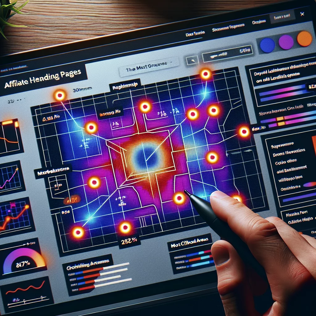
Heatmaps are visual representations of data showing how users interact with your web pages. They use color coding to indicate levels of activity; for instance, red areas might represent where users click the most, while blue areas indicate less engagement. It’s one of those tools that make me feel like I have a superpower as it lets me see the real behavior of visitors on my affiliate landing pages.

From my experience, using heatmaps means I can go beyond traditional analytics. Instead of just seeing numbers and percentages, I’m able to visualize how people engage with my content, where their eyes land first, and what catches their interest. This insight is invaluable when trying to drive conversions.

I’ve found that different types of heatmaps serve distinct purposes. Click heatmaps show where users click. Scroll heatmaps reveal how far down they scroll. Attention heatmaps indicate where users are focusing their attention. So, understanding these tools gets you a step closer to optimizing your pages effectively.

Setting Up Heatmaps Correctly

Selecting the Right Tool

There are countless tools out there for generating heatmaps, but not all are created equal. My go-to tools include Crazy Egg and Hotjar. Both have unique features and offer generous free trials. Trying them out gives you a sense of which fits best with your specific traffic and goals.

When I first started using heatmaps, I went through a few different platforms before I found one that clicked—no pun intended. It’s crucial to choose a tool that not only suits your needs but also integrates with your existing analytics tools. You want everything working together seamlessly.

Make sure to check if they have good customer support or an extensive knowledge base. You might need help setting things up, and a responsive support team can make all the difference.

Analyzing Heatmap Data

Identifying User Behavior Trends

Once you’ve set up heatmaps, it’s time to dive into the data. I always start by identifying any clear trends in user behavior. Are they clicking on the call-to-action buttons as you’d expect? Are there parts of the page they seem to ignore completely? These insights guide my next steps.

Take a close look, and don’t just focus on what’s happening above the fold. I’ve seen many affiliate marketers get fixated on the top part of the page, but scrolling heatmaps often reveal that significant interactions happen further down. It’s about the whole picture.

Also, don’t hesitate to compare different landing pages. For instance, if you have various offers or layouts, seeing how users respond differently can help you refine your approach massively.

Implementing Changes Based on Insights

Refining Call-to-Action Elements

After analyzing heatmap data, it’s time to make strategic changes. One common area needing adjustments is the call-to-action (CTA) buttons. I’ve often found that tweaking the placement, color, or even the text can lead to a significant bump in conversions.

For example, if a button is blending into the background, changing its color to something more eye-catching can direct attention. The same goes for phrasing—sometimes, just changing “Submit” to “Get Your Free Trial” can alter user response rates dramatically.

Don’t forget to A/B test any modifications. Every time I modify something, I run tests to see how those changes perform compared to the original design. It’s the most effective way to ensure I’m moving in the right direction.

Continuous Optimization and Learning

Making Adjustments as Needed

Heatmaps are not just a set-it-and-forget-it tool; they require ongoing attention. I check my heatmap data regularly—not just when launching new pages but also to assess existing ones. User behavior can shift over time, and staying on top of those changes is key.

For instance, if a new trend arises, I want to make sure my landing pages are aligned with what users expect. Keeping everything fresh is crucial in the fast-paced world of affiliate marketing. Being proactive helps me stay one step ahead.

Additionally, keep experimenting. Don’t be afraid to try new layouts or offers based on what you see in your data. The beauty of marketing is that it’s a never-ending learning process, and adapting is crucial for success.

FAQ

1. What is the main purpose of using heatmaps for affiliate landing pages?

Heatmaps help visualize user interactions, showing where people are clicking, scrolling, and focusing their attention. This insight is crucial for optimizing the design and layout of affiliate landing pages to increase conversions.

2. Can I use heatmaps for any type of website?

Yes, heatmaps can be beneficial for any website, but they are especially useful for landing pages that aim to convert visitors into leads or sales. They allow for personalized optimization based on user behavior.

3. How often should I check my heatmap data?

I recommend checking your heatmap data regularly, especially after implementing changes to your landing pages. It’s also good to assess trends over longer periods, as user behavior can shift.

4. Should I rely solely on heatmap data for optimization decisions?

No, heatmap data is one piece of the puzzle. Combine it with other analytics tools, A/B testing results, and user feedback for a comprehensive understanding of your audience’s needs and behaviors.

5. How long does it take to see results from changes made based on heatmap data?

The timeframe can vary depending on traffic volume and changes made. Typically, I’ve noticed measurable results within a few weeks, especially if coupled with A/B testing and ongoing adjustments.

How a Minor Adjustment to Your Landing Page Can Skyrocket Conversions

Optimizing Your Headline for Maximum Impact

Crafting a Compelling Offer

When I first realized how crucial a killer headline was for my landing page, it was a game changer. Think about it: the headline is typically the first thing visitors see. It’s got to grab their attention right away! I started experimenting with different phrases, and guess what? Some straightforward tweaks made all the difference.

Instead of generic headlines, I began using specific benefits to my audience. For instance, rather than just saying “Improve Your Skills,” I switched to “Boost Your Productivity in Just 30 Minutes a Day.” This little change not only captured interest but also catered directly to what my audience wanted.

Play around with words that create urgency or intrigue. Adding elements like “limited time offer” can spur action because it creates that essential sense of need to act now. Always remember, the headline sets the stage, so make sure it’s captivating!

Utilizing Strong Visual Elements

Now, let’s talk visuals. Your landing page isn’t just about text; it’s a visual playground! Bringing in eye-catching images related to your offer grabs attention and enhances retention. I learned this the hard way—my initial plain backgrounds and boring stock images didn’t do me any favors.

Choose visuals that resonate with your audience. For instance, if I’m promoting a fitness program, I might use images of people achieving their goals or engaging in a workout. This relatable content gets people dreaming about how they can achieve those same results.

And remember color matters! Using contrasting colors for buttons can make them pop, guiding visitors to take action. Play around with these elements—visuals are basically your silent salespeople!

Testing and Tweaking for Success

Alright, let’s get into the nitty-gritty of testing. Once I made adjustments to my headline and visuals, I didn’t just sit back. I started A/B testing different versions of my landing page. This means running experiments with two or more variations to see which one performs better. It’s where the magic happens!

After a little time running the tests, I noticed clear patterns. For instance, one headline style produced more clicks than another. This process isn’t just vital; it’s fascinating to see what resonates with your audience! Don’t be afraid to experiment—it’s part of the journey.

And don’t just stop at the headline. Test visuals, calls-to-action, and even the layout. Continual tweaking leads to long-term improvement and ensures your landing page evolves with your audience’s tastes.

Enhancing Your Call-to-Action (CTA)

Creating a Clear and Compelling CTA

Diving right into CTAs—these are make-or-break moments for your landing page. I’ve gone through my fair share of mediocre CTAs that led to lackluster results. The key is to make them clear and action-oriented. Something like “Get Started” sounds nice, but “Claim Your Free Guide Now!” has way more punch!

Also, positioning matters! I found that placing my CTA button—say, below a well-crafted paragraph describing benefits—yielded better results. It’s all about context. You want to guide your visitors naturally toward that next step.

And listen, don’t underestimate the power of urgency. Phrases like “Limited offer” or “Only a few left” can create that sense of urgency needed to boost conversions. Make your audience feel like they have to act quickly!

Designing for Mobile Optimization

Let’s not forget about mobile users—this is an area I overlooked at first. Nowadays, many people browse primarily on their phones, so it’s essential that your landing page looks good on smaller screens. I can’t stress it enough: make sure your design is responsive!

I started using tools like Google’s Mobile-Friendly Test, and the results were eye-opening. Pages that were hard to navigate on mobile led to high bounce rates. I couldn’t allow that! So I revamped the design to ensure seamless browsing on any device.

Also, pay attention to load times. If it takes too long for the page to load, you’ll lose visitors faster than you can say “conversion.” Optimize images and minimize unnecessary elements to keep things running smoothly!

Leveraging Testimonials and Social Proof

Let’s chat about social proof. I’ve learned that showcasing testimonials can elevate credibility and trust on my landing page. When visitors see that others have benefited from a service or product, they’re more likely to convert. This was a game-changer for me!

I started carefully curating testimonials, highlighting different aspects of what my customers love. With real names and photos, it adds credibility. My favorite approach is using video testimonials—talk about authentic experience that truly resonates!

In addition, consider adding trust badges or quotes from well-known figures in your industry. This little nudge can turn a wary visitor into a loyal customer. People love to see validation before they make a decision; show them the benefits through others’ experiences!

Final Thoughts and Continuous Improvement

Reviewing Analytics for Insight

Now that I’ve made adjustments, it’s time to check statistics. The beauty of digital marketing is that it gives us data to analyze. I started using tools like Google Analytics, which has been invaluable for tracking visitor behavior and conversions.

By paying attention to where visitors drop off or what sections hold their attention, I gained insights on what works and what doesn’t. It’s like having a roadmap to success! I recommend setting aside time regularly to review these insights—your landing page is an evolving entity.

Remember, the goal is to optimize continually. Don’t just set it and forget it! Regularly tweak elements based on your findings; this will keep your landing page fresh and relevant to your audience.

Staying Updated with Industry Trends

One of the coolest parts about digital marketing is that it’s always changing. What worked wonders a few months ago might not have the same impact today. I’ve kept myself updated on trends, whether through webinars, industry blogs, or networking.

Following leading marketers and thought leaders also helps. By staying informed and adapting to trends, I’m not just improving my landing page; I’m effectively future-proofing my business. The willingness to learn and adapt is a core trait in today’s fast-paced world.

So don’t miss out on this—it’s a full-time job in itself! But trust me, it pays off in spades when you see those conversion numbers rise.

Encouraging User Feedback and Iteration

Lastly, I’d be remiss not to mention the importance of feedback. I’ve often sought insights from users about their experience on my landing page. Sometimes a quick survey right after they interact can yield fantastic insights on what works and what doesn’t.

Be open to constructive criticism! I’ve made changes based on feedback that transformed the user experience entirely. Engaging with your audience ensures they feel valued, and that translates into a higher likelihood of conversions.

Iteration is key. Don’t fear making changes based on feedback—embrace it! Each tweak can lead to better performance and a more enjoyable experience for visitors.

Frequently Asked Questions

1. What is the most critical element of a landing page?

The headline is often considered the most crucial element because it’s the first thing visitors see. It should grab their attention and communicate value immediately.

2. How important are visuals on a landing page?

Visuals play a crucial role in keeping visitors engaged. They can enhance understanding and retention of the message, making it visually appealing and relatable to the audience.

3. What kind of testing should I perform on my landing page?

A/B testing different elements such as headlines, images, and calls-to-action can provide valuable insights on what works best for your audience.

4. How can I improve my call-to-action?

Make sure your CTA is clear and action-oriented. Use persuasive language, position it effectively, and consider adding urgency to encourage immediate action.

5. Why is feedback from users important?

User feedback is essential for continuous improvement. It helps you understand the visitor’s experience and identify areas for enhancement, leading to better conversions over time.

3 Easy Steps to Optimize Your Landing Pages Today

Understand Your Audience

Research Your Target Market

First off, the key to hitting the bullseye with your landing page is knowing who you’re trying to reach. I can’t stress enough how important it is to do your homework. Dive into market research to get a real feel for your audience’s needs and pain points. Use surveys, social media polling, or even Google Trends to find out what makes your audience tick.

Once you gather that info, use it to tailor your landing page messaging. Just imagine walking into a party and immediately knowing what everyone loves to talk about. That’s the kind of vibe you want to create—make your landing page feel like it gets them.

Don’t forget to look at your competitors, too. Checking out what has worked (or not) for them can give you insights on how to position yourself better. A little healthy spying can go a long way in this game!

Create Compelling Content

Now that you know your audience, let’s talk content. You want your landing page to speak directly to them. Start with an irresistible headline that grabs attention. I once spent hours working on a headline that ended up being the magic key to higher conversions—so don’t rush this part!

Once you’ve got that catchy headline, flesh it out with concise, relevant, and engaging content. Use bullet points, subheadings, and images to make it skimmable. Let’s be honest—nobody wants to read a wall of text. So break it down for them!

Lastly, don’t forget about calls-to-action (CTAs). Each section should ideally guide your visitor toward taking that next step, whether it’s signing up, making a purchase, or just learning more. Make those CTAs pop and feel important!

Optimize for SEO

Okay, listen up! You can have the most beautiful landing page in the world, but if folks can’t find it, what’s the point? That’s where Search Engine Optimization (SEO) struts in. My approach has always been to sprinkle the right keywords throughout the page. Think about what terms your audience is typing into Google.

Include those keywords in headings, subheadings, and even image alt texts (yup, don’t overlook those!). This will help search engines know what your page is about, which can boost your visibility. Remember, the internet can feel like a sea of content—use SEO as your compass!

Don’t forget about site speed and mobile optimization. Sluggish loading times and clunky mobile experiences will send potential leads packing faster than you can say “bounce rate.” Ensure your landing page loads swiftly on all devices—that little speed boost can do wonders for your conversion rates.

Test and Analyze Your Landing Page

Utilize A/B Testing

Alright, time to get scientific! A/B testing is like the playground of marketing. It’s where you can whip up different versions of your landing page to see what resonates best without playing a guessing game. Trust me, I’ve run countless tests, and they’ve revealed some eye-opening results.

You can tweak headlines, images, CTAs, and even the color scheme. Sometimes the smallest changes can lead to a significant uptick in performance. So, set up your variations, and don’t be afraid to experiment!

Keep an open mind—what you think works may not always be the case. Often, the results surprise me, showing preferences I hadn’t even considered. It’s all learning, and it pushes your landing page towards better performance.

Analyze Your Data

Once you’ve done some testing, it’s time to look at the data and decipher what it’s telling you. Tools like Google Analytics are your best friends here. I often spend time with data to really grasp how folks are interacting with my pages. This analytics game is where the magic happens!

Monitor key metrics like bounce rate, time spent on the page, and the conversion rate. They tell you if your landing page is doing its job or if it’s time for a makeover. If visitors are leaving quickly, there’s a good chance something’s off balance, and you’ll want to dive into those pain points.

Use the insights you gather to iterate constantly. Your landing page isn’t a one-and-done job. It’s an evolving entity that should transform as you learn more about your audience’s preferences. Keep it fresh and relevant!

Gather Feedback

Finally, never underestimate the value of feedback. Customer insights are gold! Whether it’s a quick feedback form or a more in-depth survey, listening to your audience can uncover invaluable information about their experience.

Sometimes, just asking what they thought about the page can highlight things you might have missed. It’s like having a personal assistant who sees things you don’t! Use these insights to tweak your page even more.

Engaging your audience in this way also builds a connection, making them feel valued and heard. And who doesn’t want to feel appreciated? So, make it part of your process and watch your landing page evolve for the better.

FAQs

1. What is the most important element of a landing page?

While there are many components, the headline often has the most significant impact. It’s the first thing visitors see, so it needs to grab their attention and convey the value of what you’re offering.

2. How frequently should I conduct A/B testing?

A/B testing can be done regularly based on your traffic levels and the significance of changes you’re considering. Generally, I recommend testing one aspect at a time and running tests for at least a couple of weeks.

3. Is it essential to optimize for mobile users?

Absolutely! With more people browsing via mobile devices, having a mobile-optimized landing page is non-negotiable. If your page doesn’t display well on mobile, you’ll miss out on a huge chunk of potential conversions.

4. How can I identify my target audience?

You can use tools like audience insights on social media platforms, surveys, and keyword research. Diving into analytics can also reveal demographic data that can help in refining your target audience.

5. What tools can I use for landing page analytics?

Google Analytics is a fantastic starting point. Additionally, tools like Hotjar and Crazy Egg offer heatmaps and user recordings to gain deeper insights into user behavior on your landing page.

Exit mobile version